Affective color scales for colormap data visualizations
Halle Braun -
Kushin Mukherjee -
Seth Gorelik -
Karen Schloss -
Download preprint PDF
Download Supplemental Material
Room: Hall M2
2025-11-06T09:06:00.000ZGMT-0600Change your timezone on the schedule page
2025-11-06T09:06:00.000Z
https://youtu.be/gHCENa3C9X4
Keywords
Visual reasoning, visual communication, color cognition, affective science, emotion, scalar field, data-aware design
Abstract
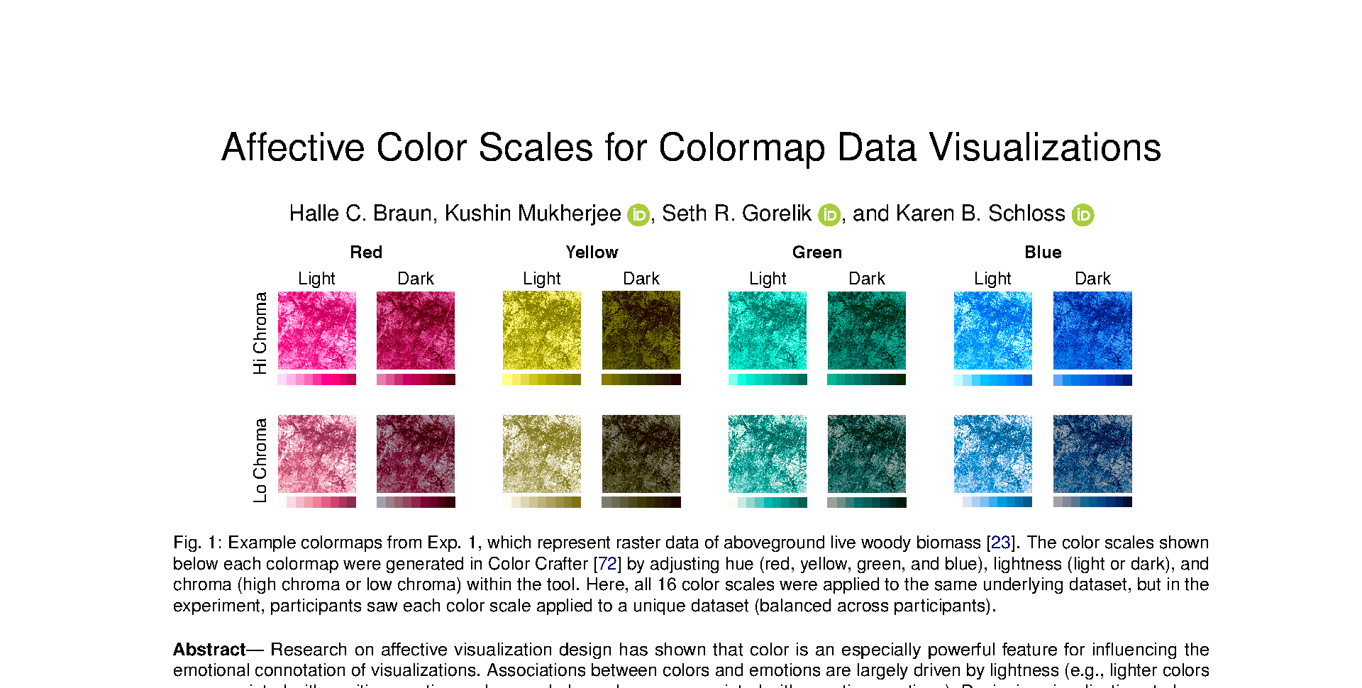
Research on affective visualization design has shown that color is an especially powerful feature for influencing the emotional connotation of visualizations. Associations between colors and emotions are largely driven by lightness (e.g., lighter colors are associated with positive emotions, whereas darker colors are associated with negative emotions). Designing visualizations to have all light or all dark colors to convey particular emotions may work well for visualizations in which colors represent categories and spatial channels encode data values. However, this approach poses a problem for visualizations that use color to represent spatial patterns in data (e.g., colormap data visualizations) because lightness contrast is needed to reveal fine details in spatial structure. In this study, we found it is possible to design colormaps that have strong lightness contrast to support spatial vision while communicating clear affective connotation. We also found that affective connotation depended not only on the color scales used to construct the colormaps, but also the frequency with which colors appeared in the map, as determined by the underlying dataset (data-dependence hypothesis). These results emphasize the importance of data-aware design, which accounts for not only the design features that encode data (e.g., colors, shapes, textures), but also how those design features are instantiated in a visualization, given the properties of the data.