The Categorical Data Map: A Multidimensional Scaling-Based Approach
Frederik L. Dennig - University of Konstanz, Konstanz, Germany
Lucas Joos - University of Konstanz, Konstanz, Germany
Patrick Paetzold - University of Konstanz, Konstanz, Germany
Daniela Blumberg - University of Konstanz, Konstanz, Germany
Oliver Deussen - University of Konstanz, Konstanz, Germany
Daniel Keim - University of Konstanz, Konstanz, Germany
Maximilian T. Fischer - University of Konstanz, Konstanz, Germany
Download preprint PDF
Room: Bayshore I
2024-10-13T17:45:00ZGMT-0600Change your timezone on the schedule page
2024-10-13T17:45:00Z
Abstract
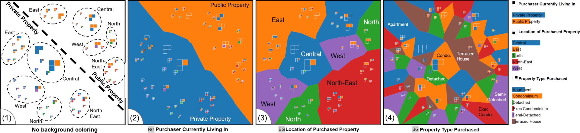
Categorical data does not have an intrinsic definition of distance or order, and therefore, established visualization techniques for categorical data only allow for a set-based or frequency-based analysis, e.g., through Euler diagrams or Parallel Sets, and do not support a similarity-based analysis. We present a novel dimensionality reduction-based visualization for categorical data, which is based on defining the distance of two data items as the number of varying attributes. Our technique enables users to pre-attentively detect groups of similar data items and observe the properties of the projection, such as attributes strongly influencing the embedding. Our prototype visually encodes data properties in an enhanced scatterplot-like visualization, visualizing attributes in the background to show the distribution of categories. In addition, we propose two graph-based measures to quantify the plot's visual quality, which rank attributes according to their contribution to cluster cohesion. To demonstrate the capabilities of our similarity-based projection method, we compare it to Euler diagrams and Parallel Sets regarding visual scalability and evaluate it quantitatively on seven real-world datasets using a range of common quality measures. Further, we validate the benefits of our approach through an expert study with five data scientists analyzing the Titanic and Mushroom dataset with up to 23 attributes and 8124 category combinations. Our results indicate that our Categorical Data Map offers an effective analysis method for large datasets with a high number of category combinations.